BRANDING BY SFN PRODUCTIONS
SFN Productions provides creative direction and creative producing across branding, campaigns, and content systems, bridging strategy and execution to ensure work is not only strong creatively, but delivered consistently across channels. Below are selected examples of brand and campaign work we’ve overseen, including creative direction, messaging, design oversight, and asset systems built to scale.
Festival Branding & Creative Direction
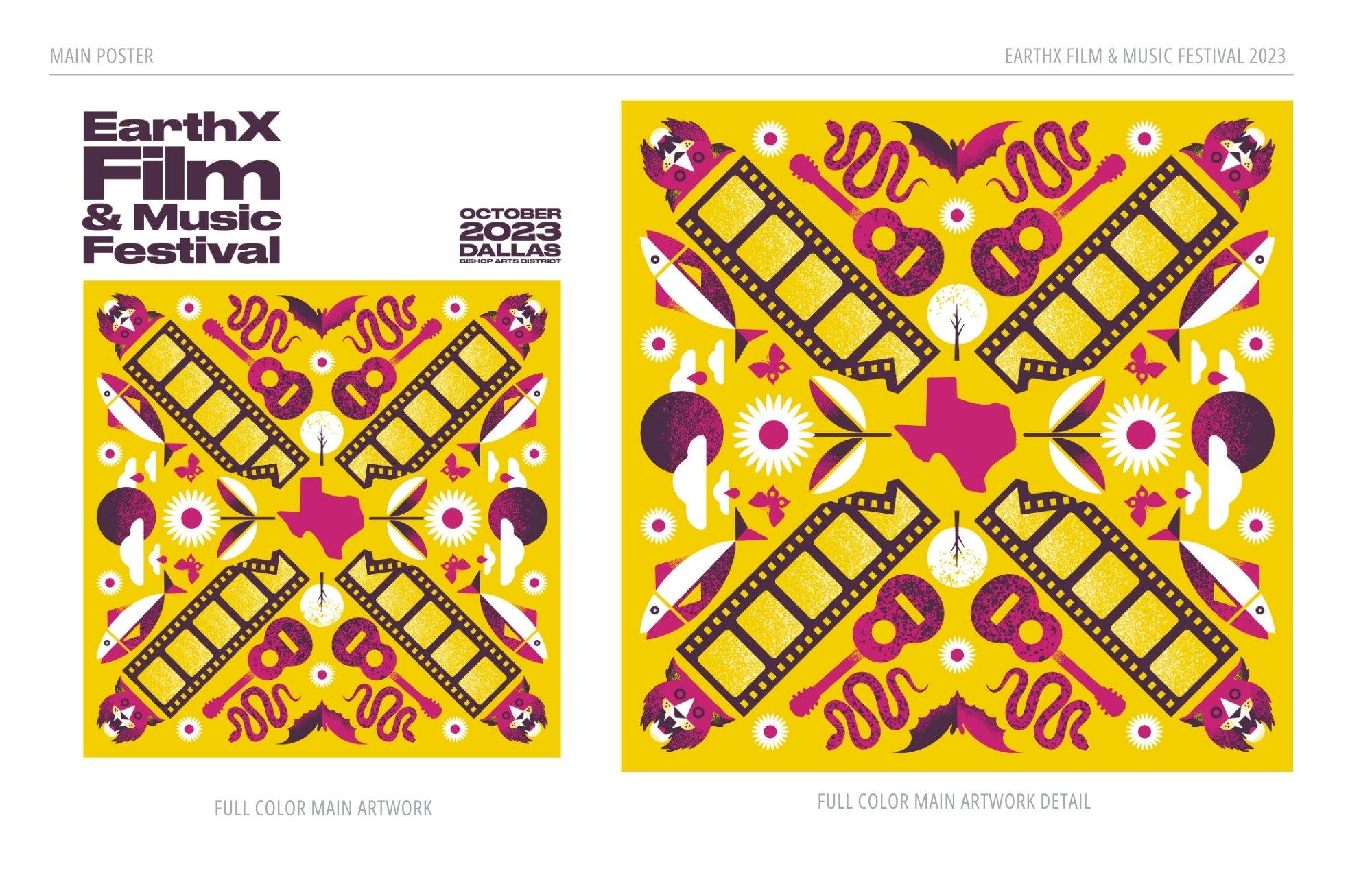
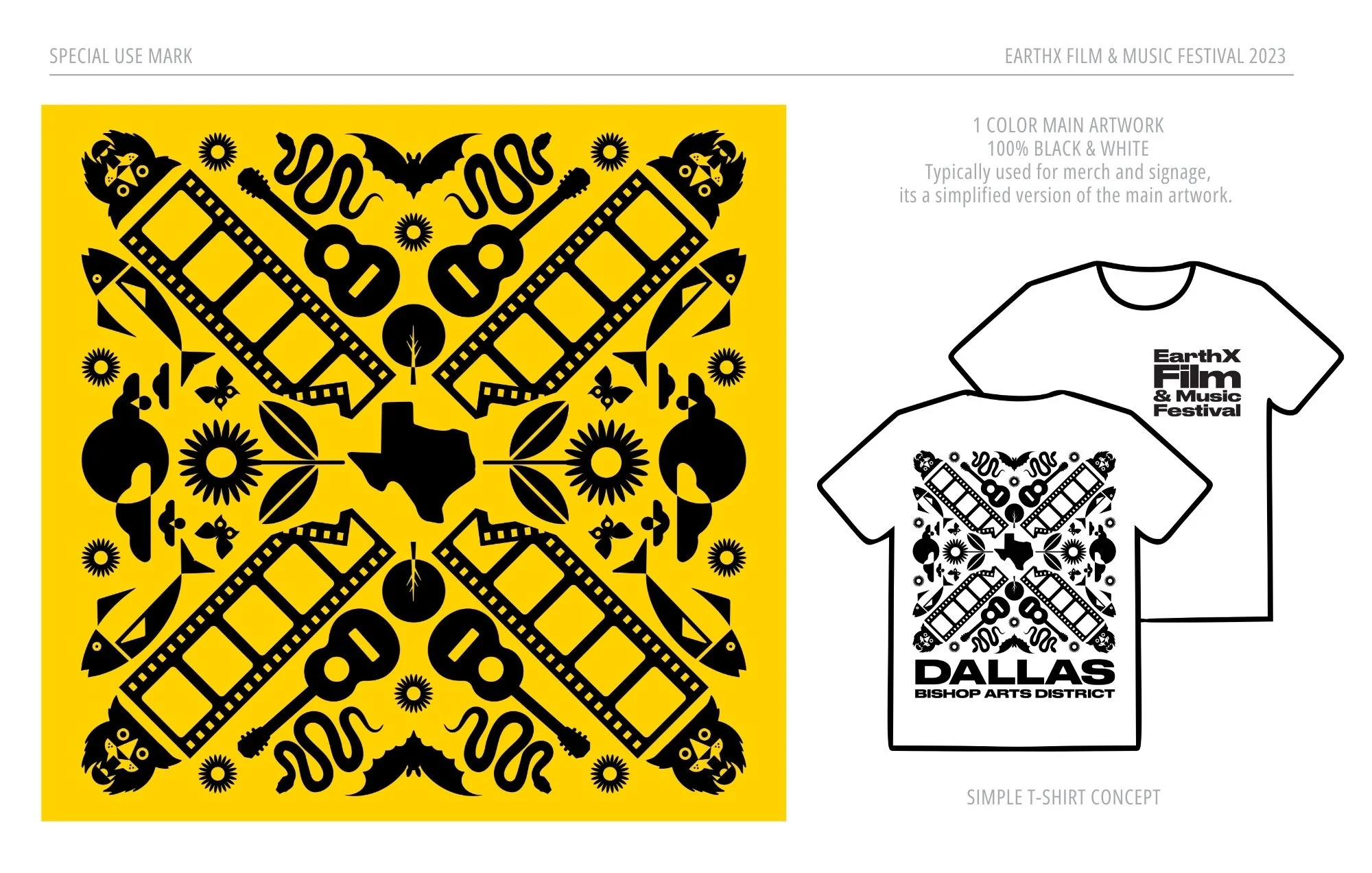
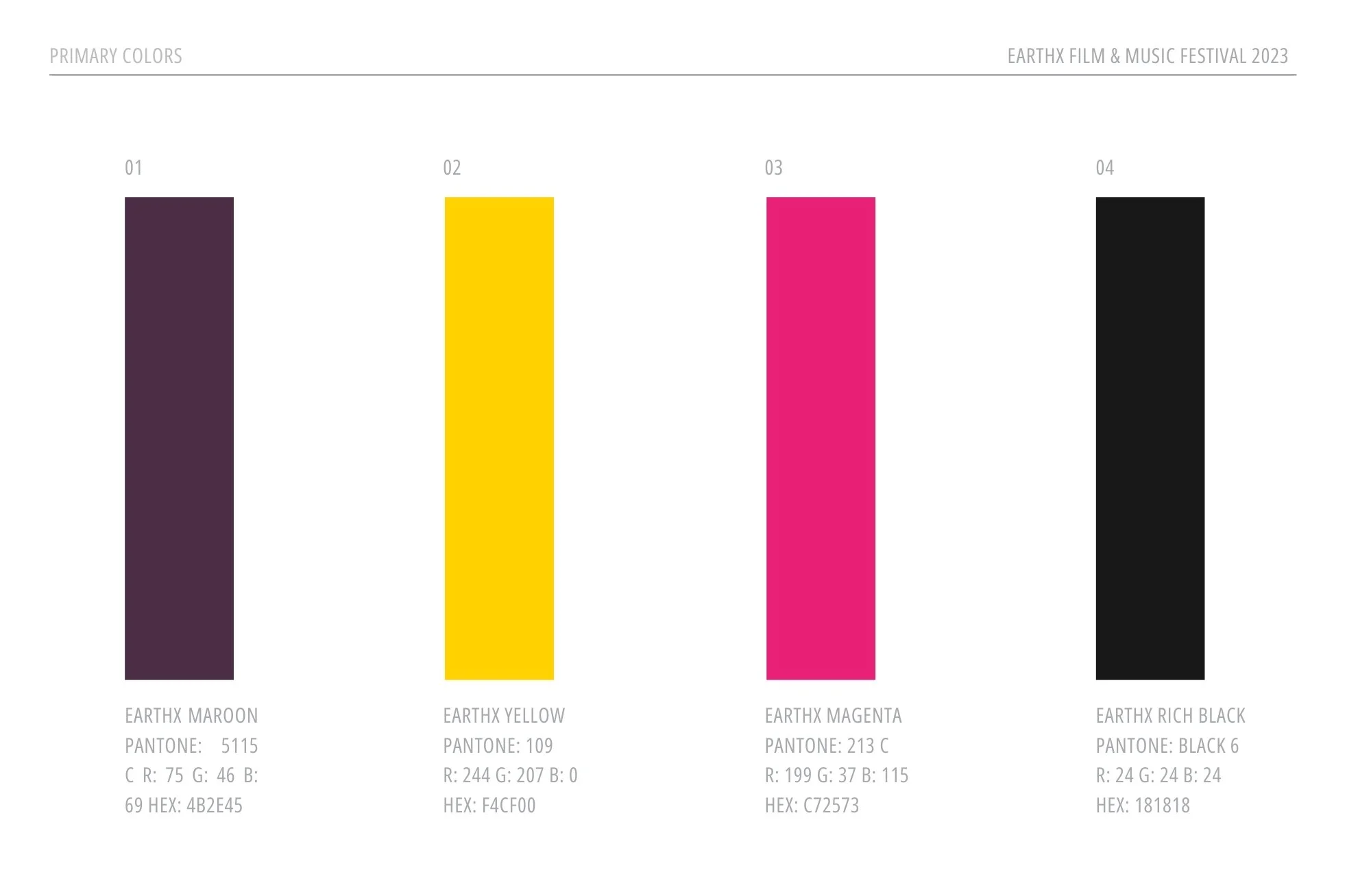
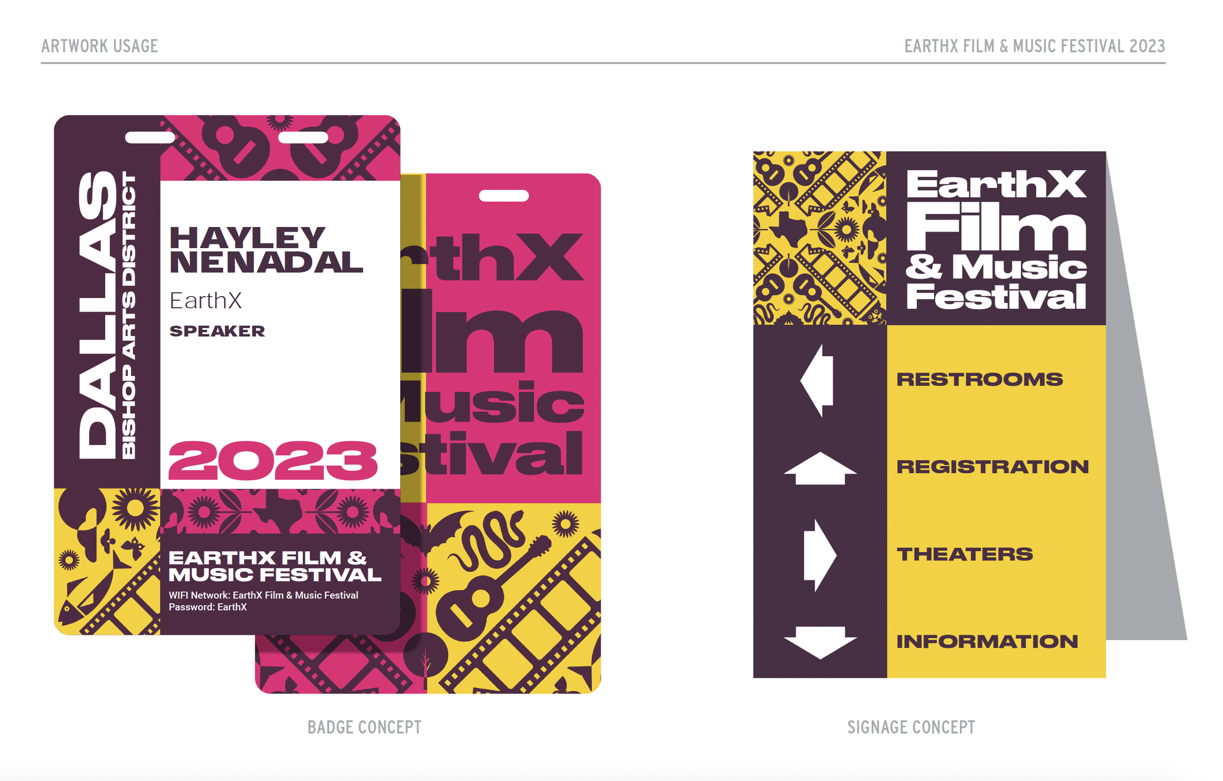
PROJECT: EarthX Film Festival 2023 Branding
ORGANIZATION: EarthX Film Festival
ROLE: Creative Director — Kelsie Key
DESIGNER: John Mata
OVERVIEW:
The EarthX Film Festival required a cohesive brand system for its 2023 festival that could support a wide range of touchpoints, from digital promotion to on-site festival materials, while remaining aligned with the organization’s mission-driven storytelling.
APPROACH:
Kelsie Key led creative direction for the festival’s branding, establishing the overall visual tone, messaging direction, and system requirements. Working closely with designer John Mata, the creative direction focused on balancing cinematic energy with clarity and accessibility, ensuring the brand could flex across marketing materials, event signage, and festival programming without losing cohesion.
RESULT:
The final branding system delivered a unified, recognizable look for EarthX Film Festival 2023, supporting a polished festival experience across platforms and environments. The collaboration resulted in a scalable visual identity that reinforced the festival’s role at the intersection of film, culture, and environmental impact.


Event Branding & Creative Direction
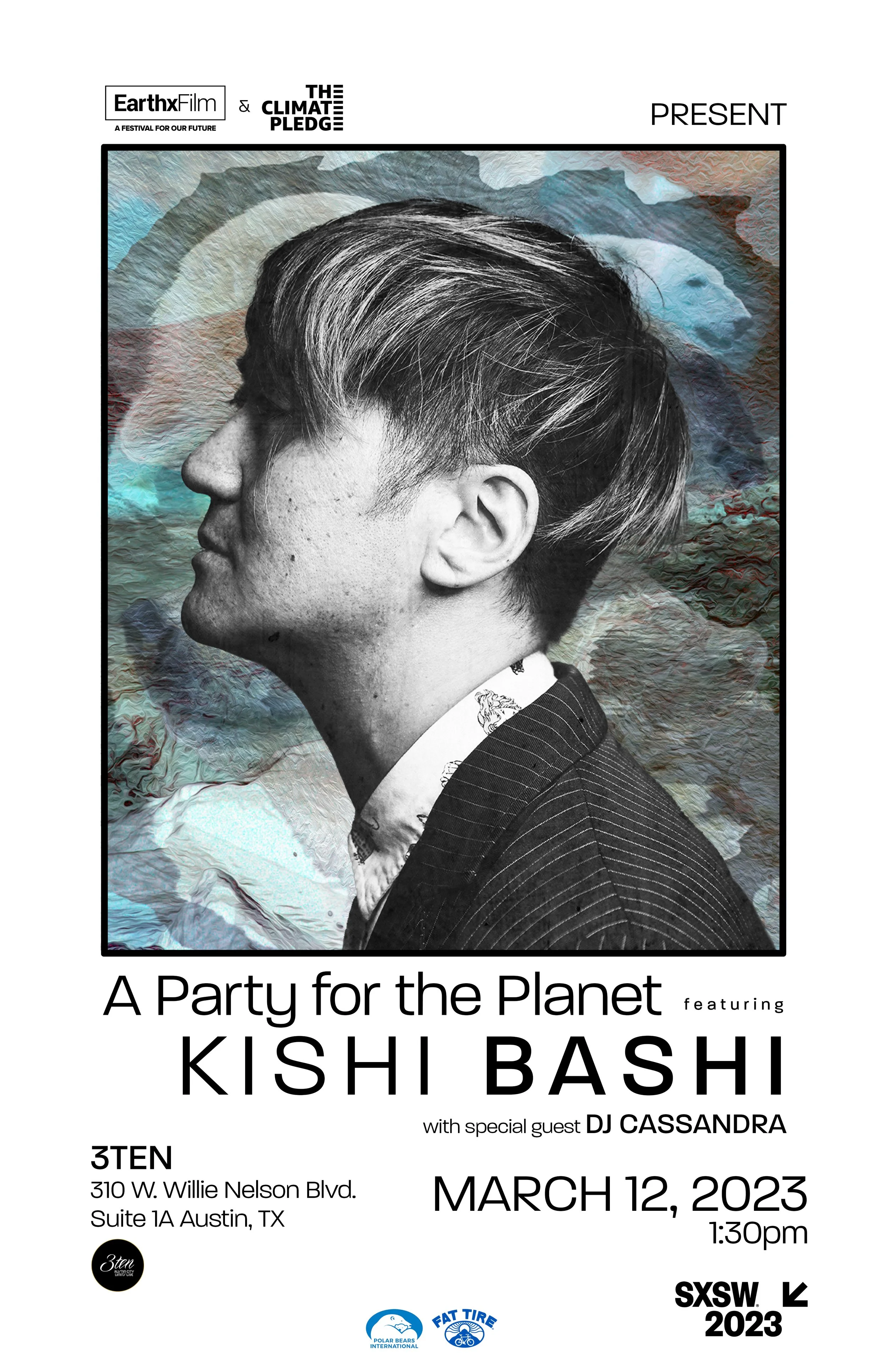
PROJECT: A Party for the Planet — SXSW Event
COLLABORATORS: The Climate Pledge, EarthX Film
FEATURED ARTIST: Kishi Bashi
EVENT: SXSW
ROLE: Creative Director & Designers (Kelsie Key & Brey Browne)
OVERVIEW:
A Party for the Planet was a branded SXSW event produced in collaboration with The Climate Pledge and EarthX Film, designed to bring together music, film, and sustainability through a shared cultural experience. The event leveraged storytelling and live performance to engage audiences around climate-focused values in an authentic, accessible way.
APPROACH:
Kelsie led creative direction and production oversight for the event’s branding and visual identity. In collaboration with The Climate Pledge and EarthX Film teams, we helped shape the creative tone, visual language, and experiential elements to ensure alignment across partners while maintaining a cohesive, culturally relevant presence. Branding was developed to live across digital promotion, on-site visuals, and experiential touchpoints throughout SXSW.
RESULT:
The final execution delivered a unified brand experience that seamlessly blended music, film, and environmental storytelling. By pairing strong creative direction with thoughtful production oversight, A Party for the Planet stood out as a purpose-driven SXSW event, reinforcing sustainability messaging through culture, creativity, and community.
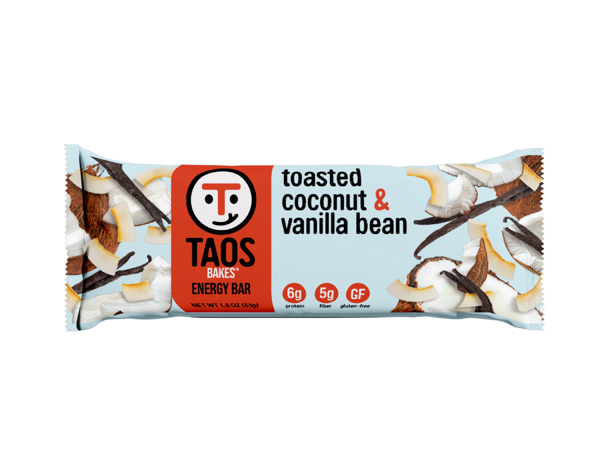
Packaging Redesign & Brand System Alignment
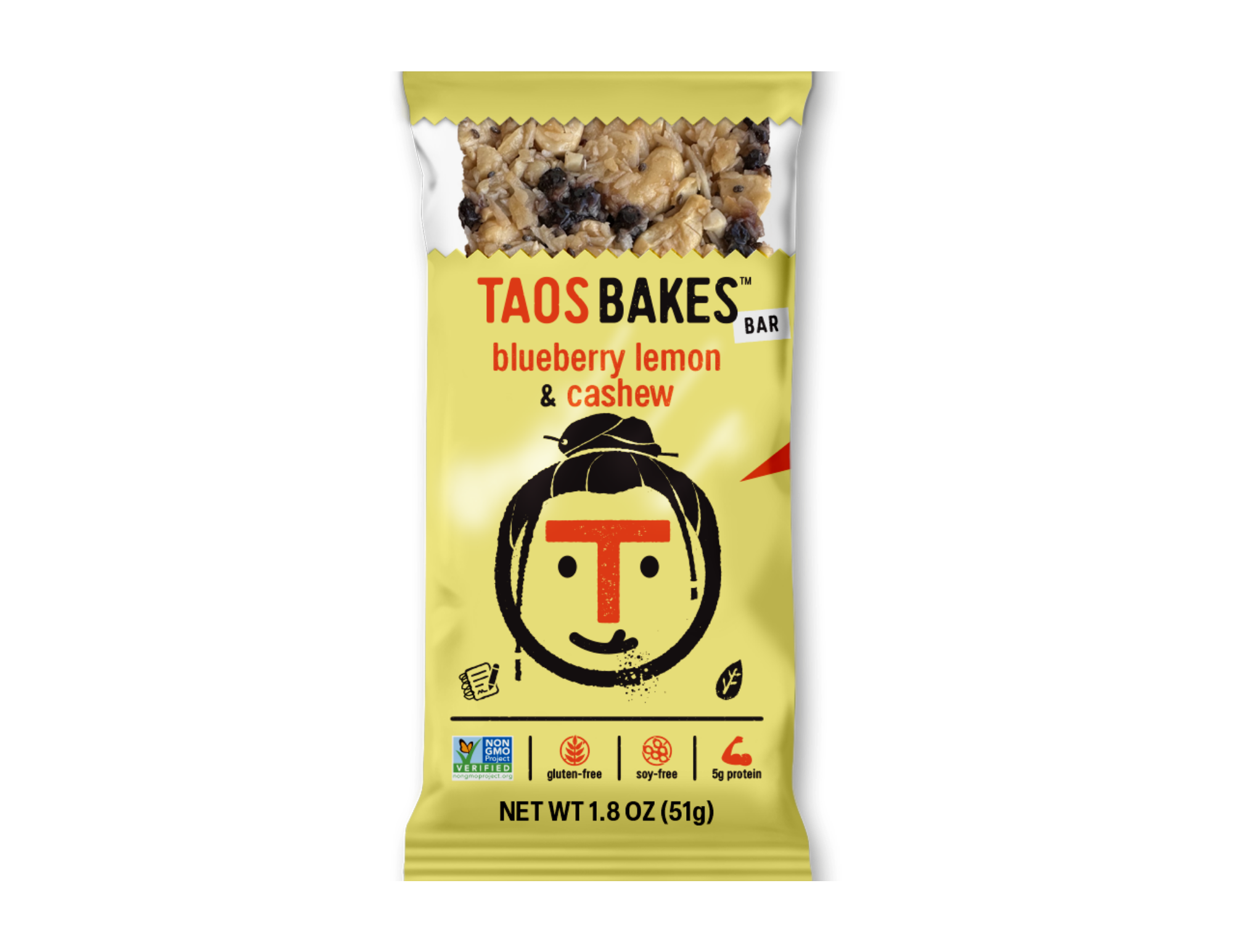
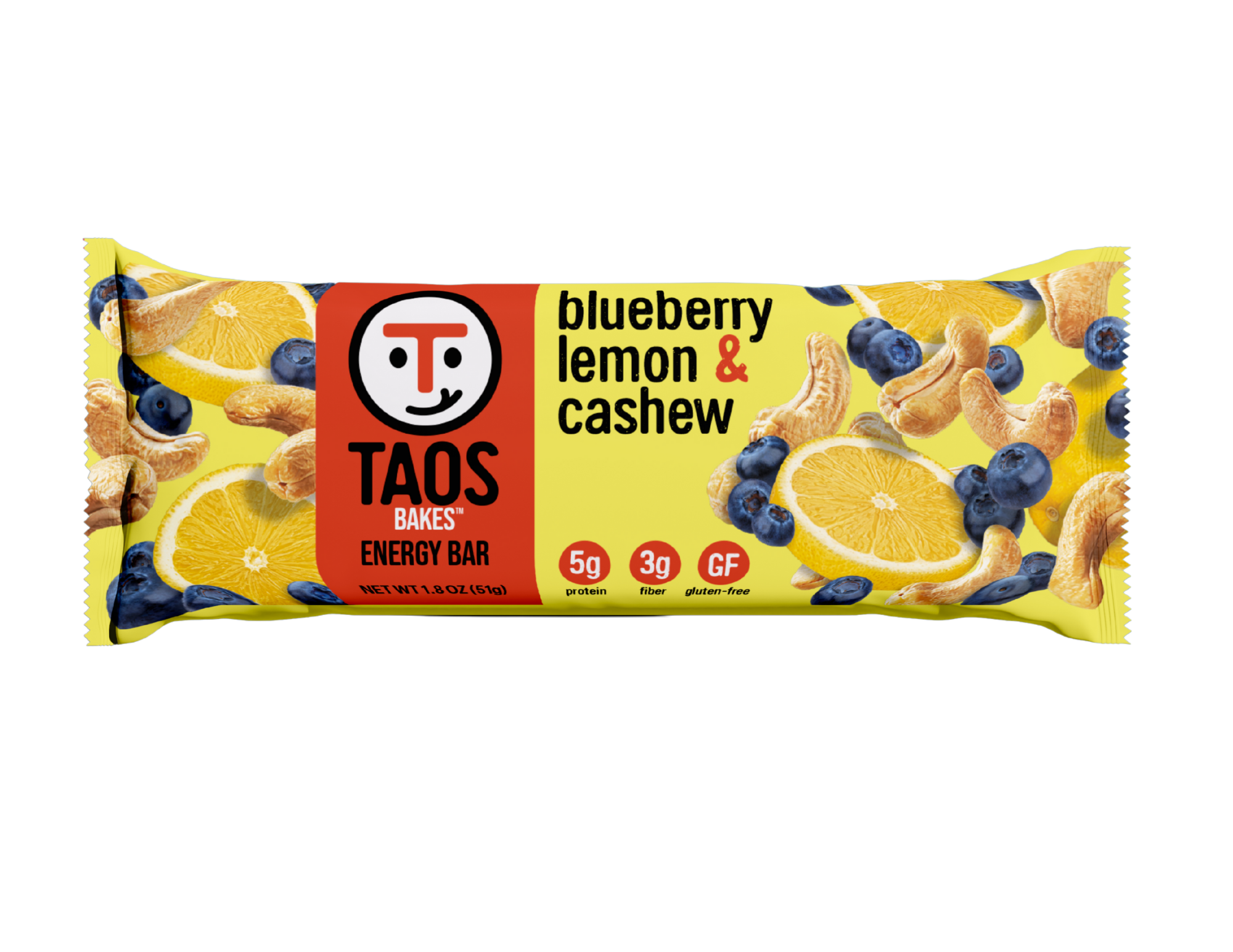
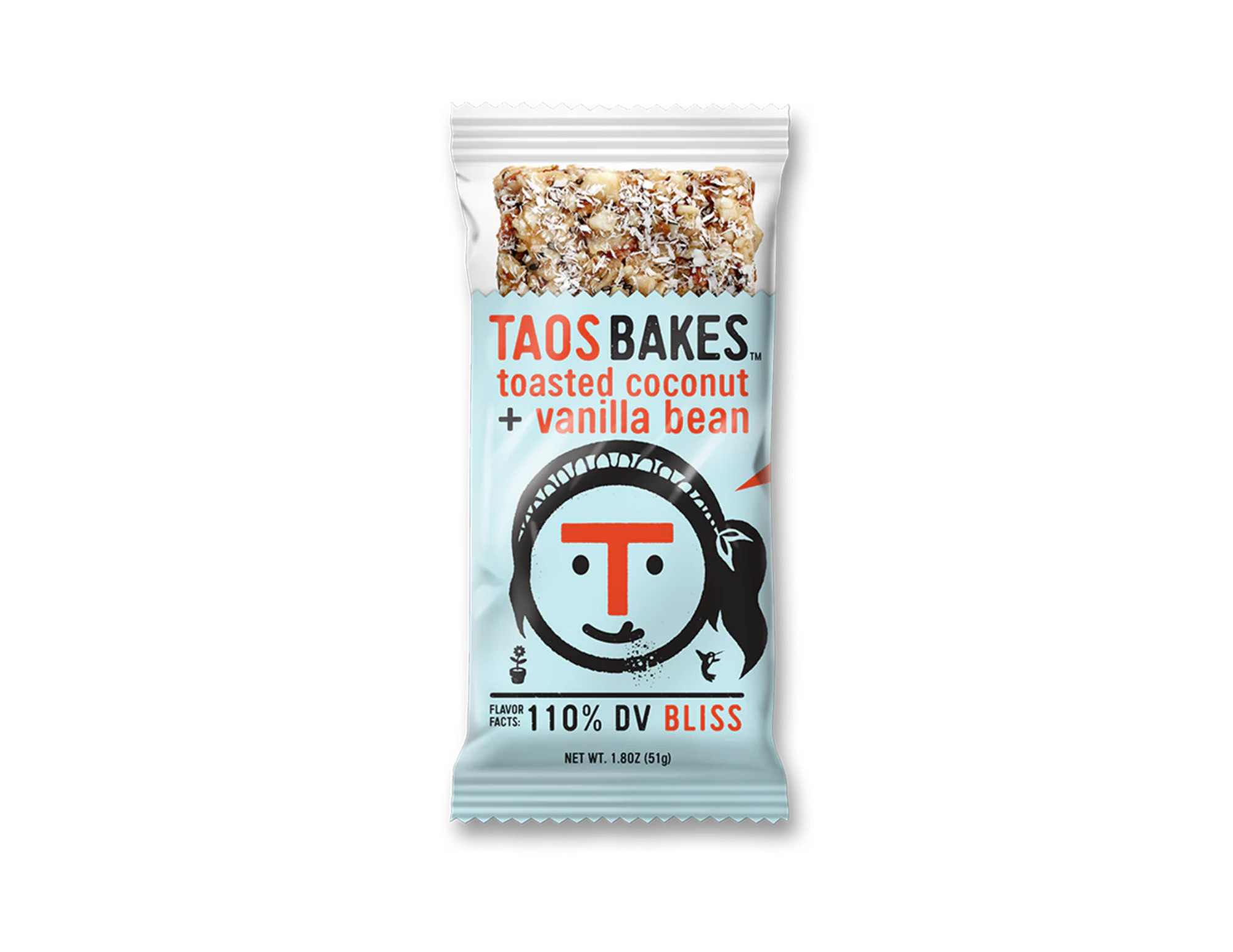
CLIENT: Taos Bakes
PROJECT: Packaging redesign + brand system unification
ROLE: Creative Director & Creative Producer
DESIGNER: John Mata
OVERVIEW:
Taos Bakes had strong products but an inconsistent and confusing packaging system across their bars. Each SKU felt disconnected, making it difficult for customers to quickly understand the brand, differentiate products, and recognize Taos on shelf or online.
APPROACH:
SFN led the creative direction and production oversight for a full packaging refresh focused on clarity and cohesion. We developed a unified visual system that balanced brand consistency with clear SKU differentiation, aligning color, typography, hierarchy, and messaging across all bars. Throughout the process, we coordinated designers, refined layouts, and ensured the system could scale as new flavors and products were added.
BEFORE
AFTER
BEFORE
AFTER
RESULT:
The refreshed packaging created immediate brand synergy across the full product line. (9 SKUS) Each bar now clearly belongs to Taos Bakes while remaining easy to distinguish, improving shelf presence, customer recognition, and overall brand confidence across retail and digital channels.
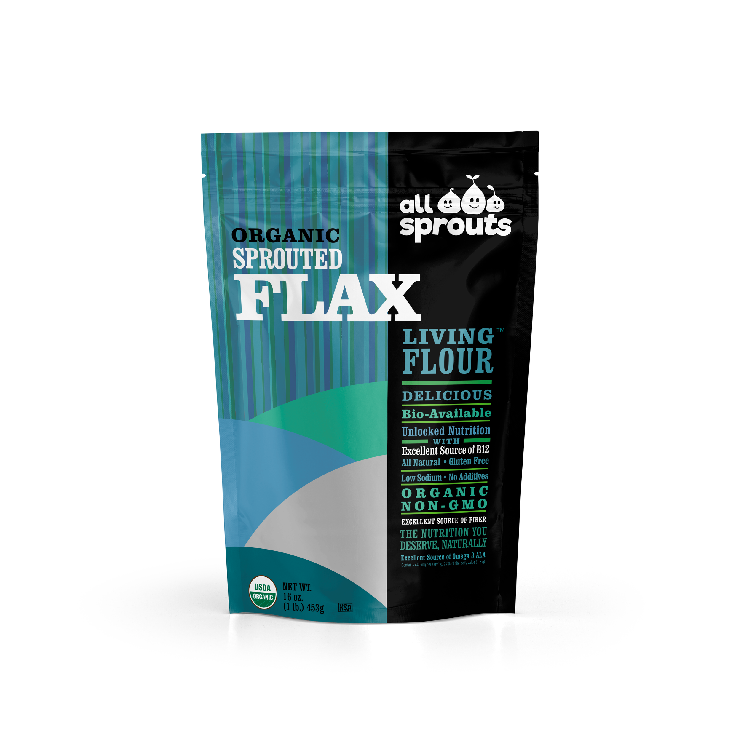
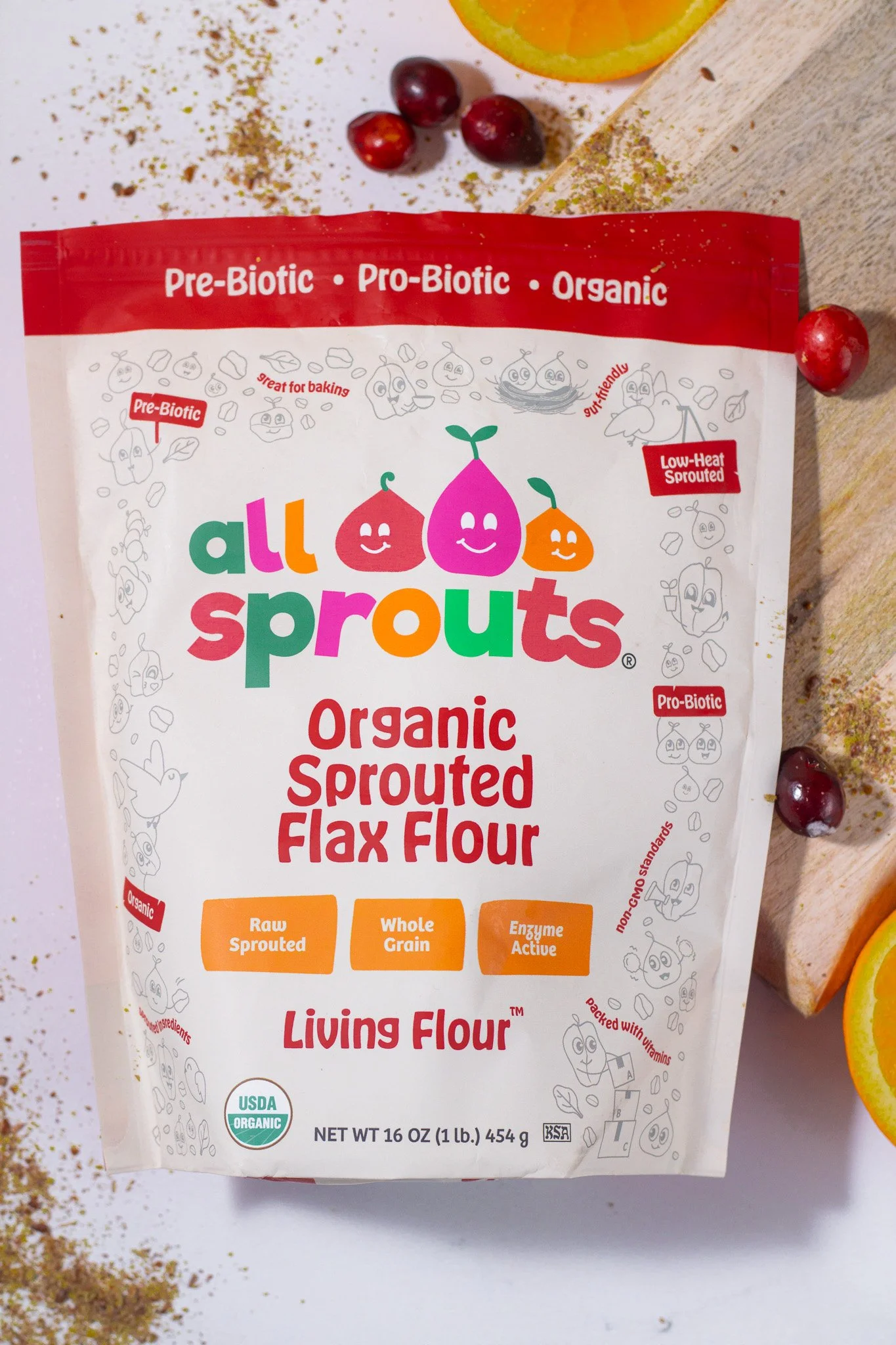
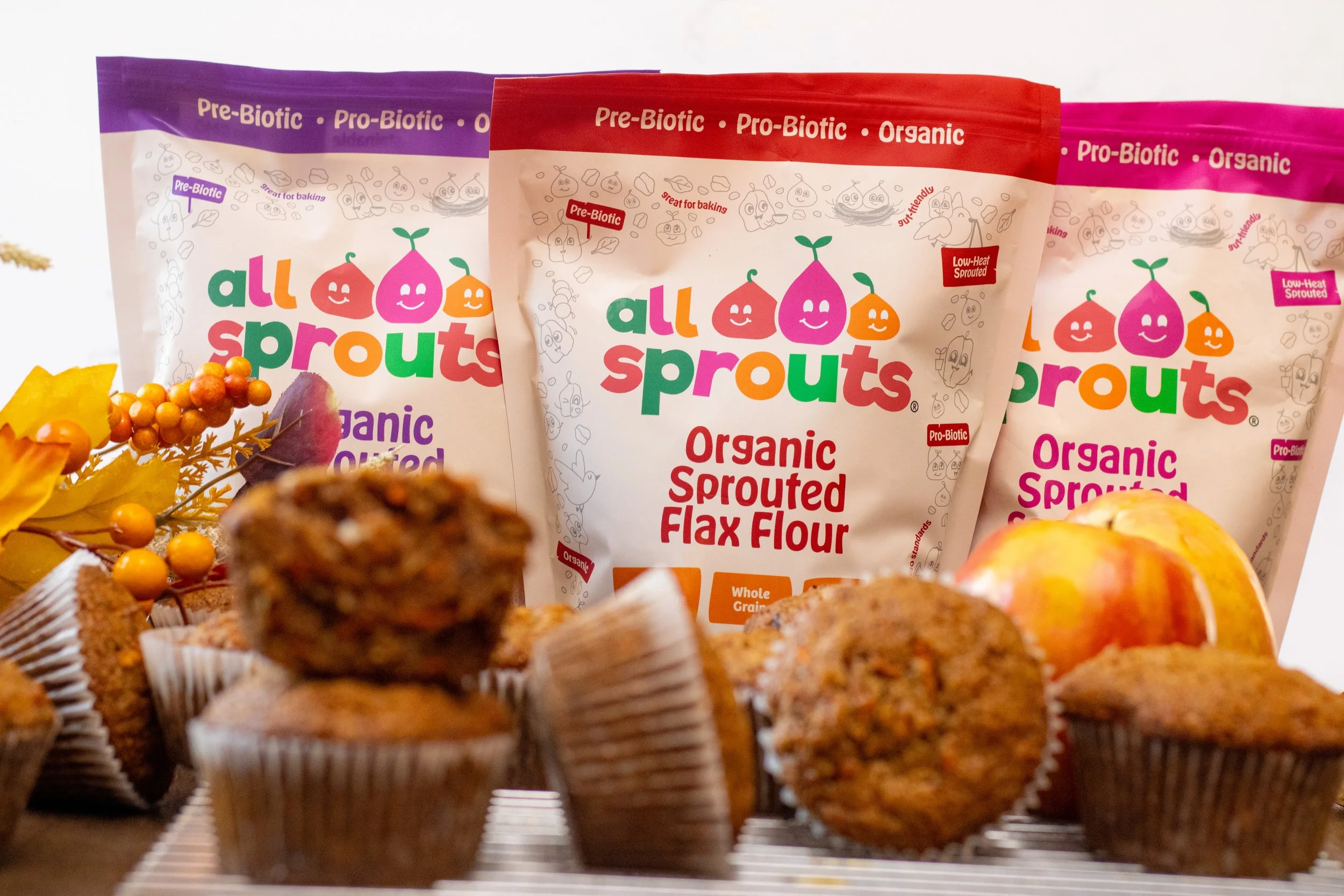
Packaging Redesign & Product Line Expansion
CLIENT: All Sprouts
PROJECT: Packaging redesign for sprouted flour line
ROLE: Creative Director & Creative Producer
DESIGNER: John Mata
OVERVIEW:
All Sprouts needed packaging that better reflected the quality of their sprouted flours while clearly communicating product benefits across a growing lineup. The existing packaging lacked visual clarity and consistency, making it harder for customers to quickly understand the product differences and value.
APPROACH:
SFN led the creative direction and production oversight for a packaging redesign focused on clarity, function, and shelf appeal. We refined the visual hierarchy, simplified messaging, and created a cohesive system that unified the product line while allowing each flour to stand on its own. The system was designed to scale as new flours are introduced, maintaining consistency without redesigning from scratch.
RESULT:
The updated packaging elevated the brand’s presence across retail and digital platforms, improved product clarity for consumers, and established a flexible, repeatable system for future growth, strengthening All Sprouts’ brand recognition across the full flour line. We oversaw the creation of 9 SKUs of flour, 8 SKUs of Baby Cereals, and helped the brand prepare for launch.
BEFORE
AFTER


Previous Clients